Redefining Playback,
making a queue that works.
The queue is a crucial feature in any music streaming app, allowing users to curate their listening sessions. However, the existing queue experience was confusing and unpredictable, leading to frustration.
My role
Lead Product Designer
Team
UX designer, iOS & Android developers, and Product Manager.
Scope
User Research, UX/UI Design, Prototyping
Tools
Figma , Usability Testing
Company
Moodagent
Year
2022
Users struggled with understanding and managing their queue due to:
Lack of clarity on what’s currently playing vs. what’s coming next.
Cumbersome queue controls, making it difficult to reorder or remove songs.
Unpredictable behavior when switching between different playlists or albums
Problem Statement
Redesign the queue experience to be more intuitive, flexible, and predictable, ensuring frictionless music playback.
Goal
We conducted user interviews, competitive analysis, and usability tests to uncover key pain points.
Key Findings
Users want more visibility - They often didn’t know where the next song was coming from.
Editing should be easier - Users found reordering and removing tracks frustrating.
Queue behavior should feel natural - Unexpected playback changes disrupted the experience.
Research & Insights
UX & Behavior
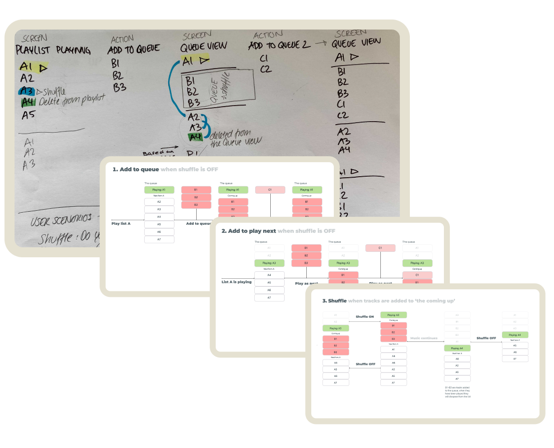
To create a more predictable playback experience, the queue redesign focused on improving both logic and interaction design.
Clear queue hierarchy: Now visually differentiates between current, upcoming, and manually added tracks.
Dynamic updates: Tracks adjust smoothly when new songs are added, reordered, or removed.
Consistent playback rules: Handling of shuffle, repeat, and manual changes is more predictable.
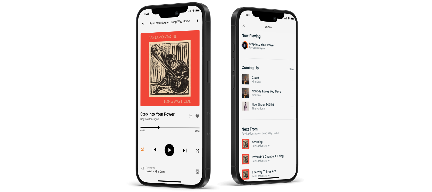
Clearer Queue Structure

To reduce confusion, we introduced a three-part queue system:
Now Playing – The current track.
Queue – Manually added songs.
Next From – Tracks from the original playlist or album that will play after the queue.
This separation provides users with a clear mental model of playback order.
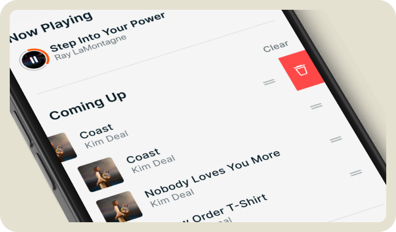
Improved Queue Management
Easier Editing: Swipe to delete, long-press to reorder, and one-tap to clear the queue.
More Control: Add to Queue places songs at the bottom, while Play Next moves them to the top.

Enhanced Playback Context
A new context UI now shows:
The source of the current song (album, playlist, or queue).
The next track’s origin, preventing surprises when switching between content.
Fewer user complaints about queue behavior.
Higher engagement with queue controls.
Improved usability, making playback interactions smoother.
Key Learnings
Context improves trust: Users feel more in control when they know what’s playing next.
Frictionless design enhances experience: Simple, intuitive interactions make a huge difference.
Predictability matters: A queue should behave exactly how users expect it to.
Impact & Result
“The new design makes the queue feel like a true extension of my music experience rather than something I have to fight against”
— Music fanatic / 32 (User test participant via UserTesting.com)
“This was one of those projects where small design tweaks made a massive impact. The attention to detail in how users interact with their queue really paid off.”
— UX Researcher (internal)
This redesign focused on simplifying interactions, improving visibility, and making playback more intuitive. By addressing core usability challenges, we created a better, more seamless queue experience that aligns with user expectations.